Ohmunity™
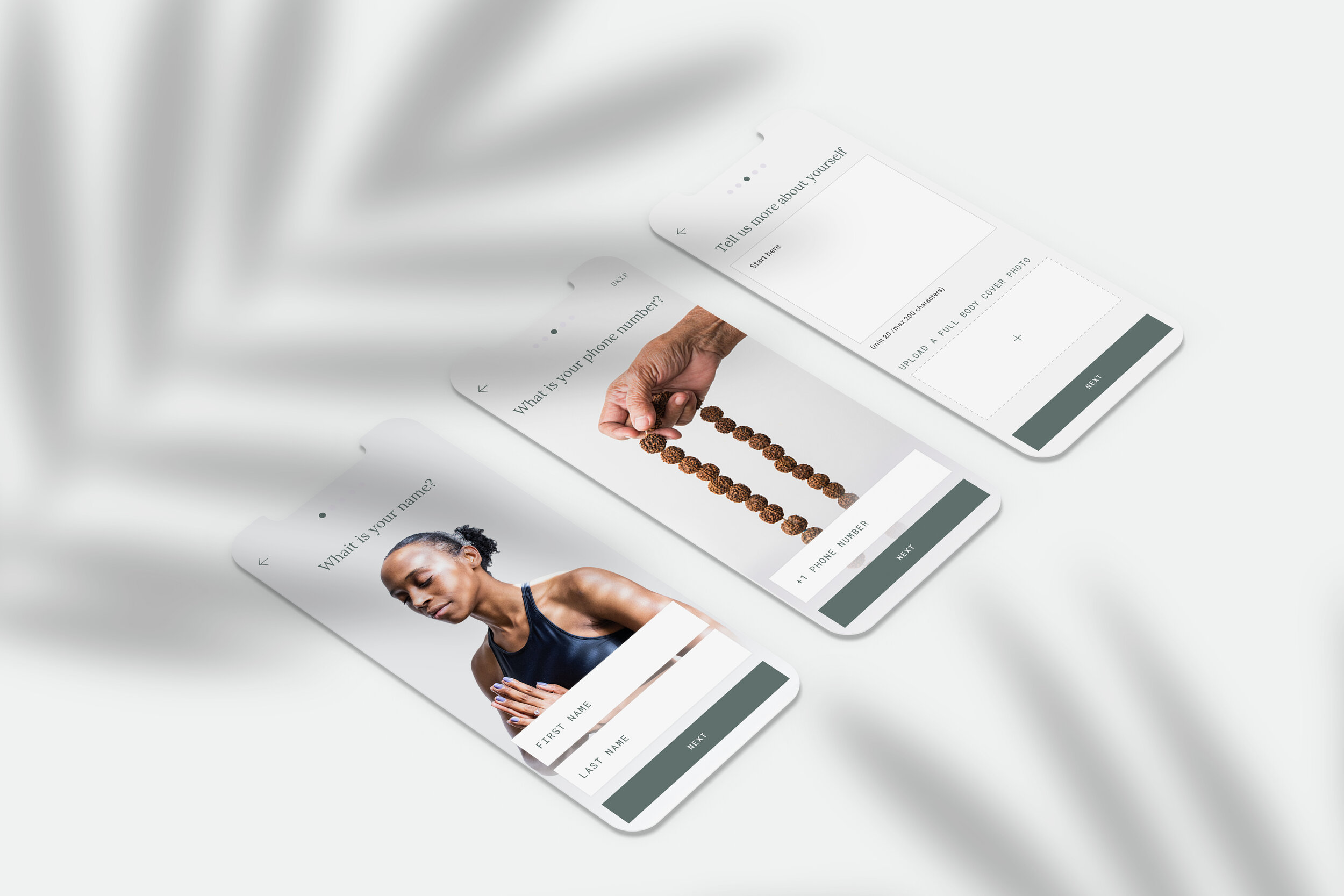
Ohmunity™ is a yoga marketplace that allows users to book group or private sessions, virtually or in person.
Role: Creative Direction, Naming, Visual Identity, User Research, Content Strategy, Information Architecture, Experience Design, Interface, Usability Testing.


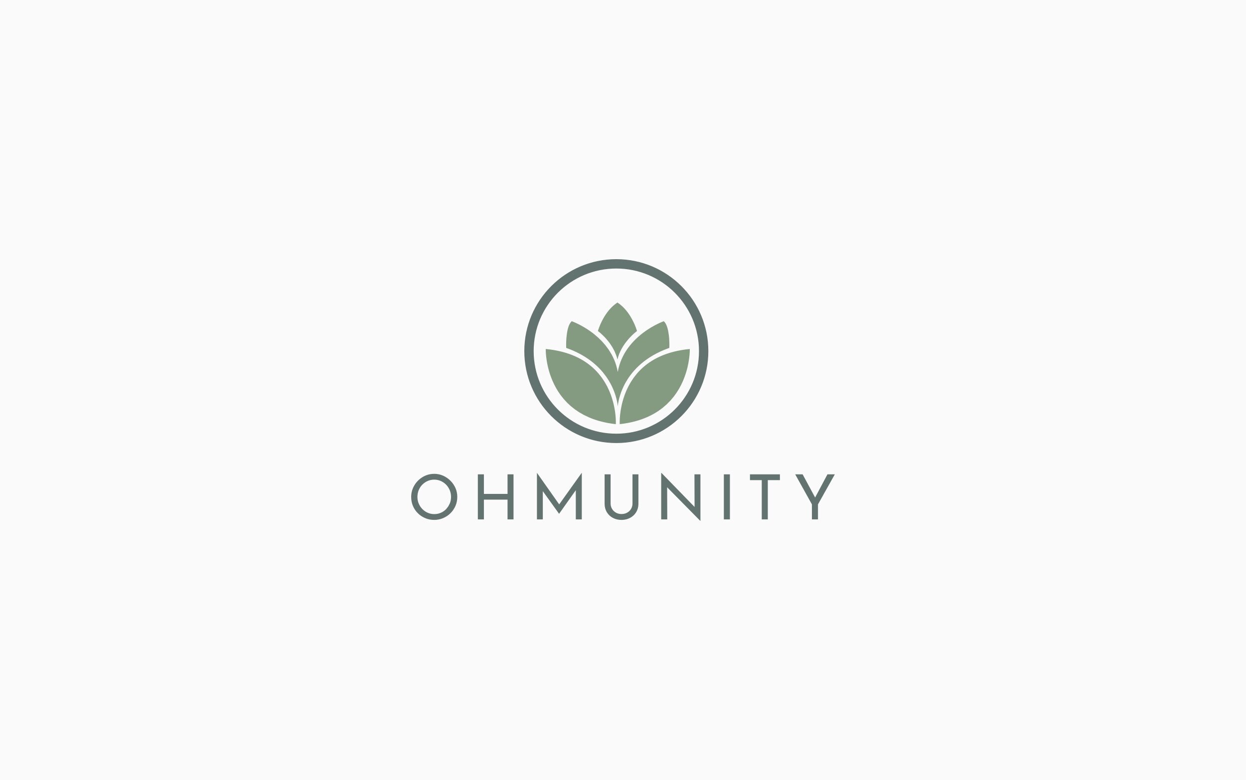
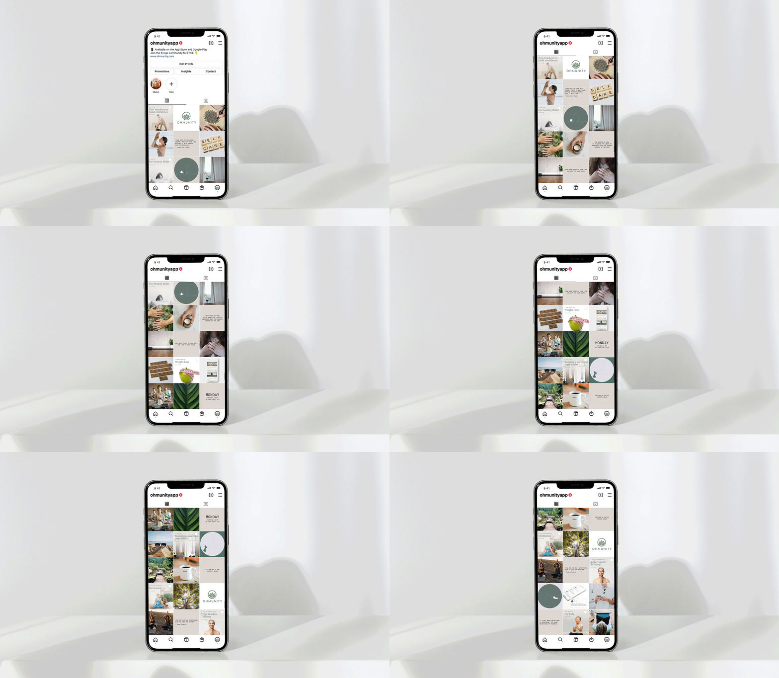
To a yogi, the Lotus flower symbolizes the expansion of the soul and spiritual awakening. To represent this, I decided to make a minimalist, easily scalable icon, incorporating the O and the lotus flower.



As I began designing the app, I started to create a component library using Sketch. Knowing the capabilities of Sketch, I decided to organize all the design elements in a single file and create a UI library using the symbol system.
Using Atomic Structure I separated it in sections with fundamental elements such as colors, fonts, iconography and grid. I continued on to add buttons, input fields and commonly used assets.


Problem
Yogis have a hard time finding the right teachers and studios to fit their needs.

Opportunity
To create a digital marketplace for yoga classes with a personalized search engine and a friendly booking experience.

Competitor Analysis Learnings
Existing applications and websites are focused on all fitness classes in general, but are not specifically focused on yoga. This presents a unique opportunity. Additionally, I learned that most apps do not showcase specials and events related to yoga which could also make it interesting for users.


Personas
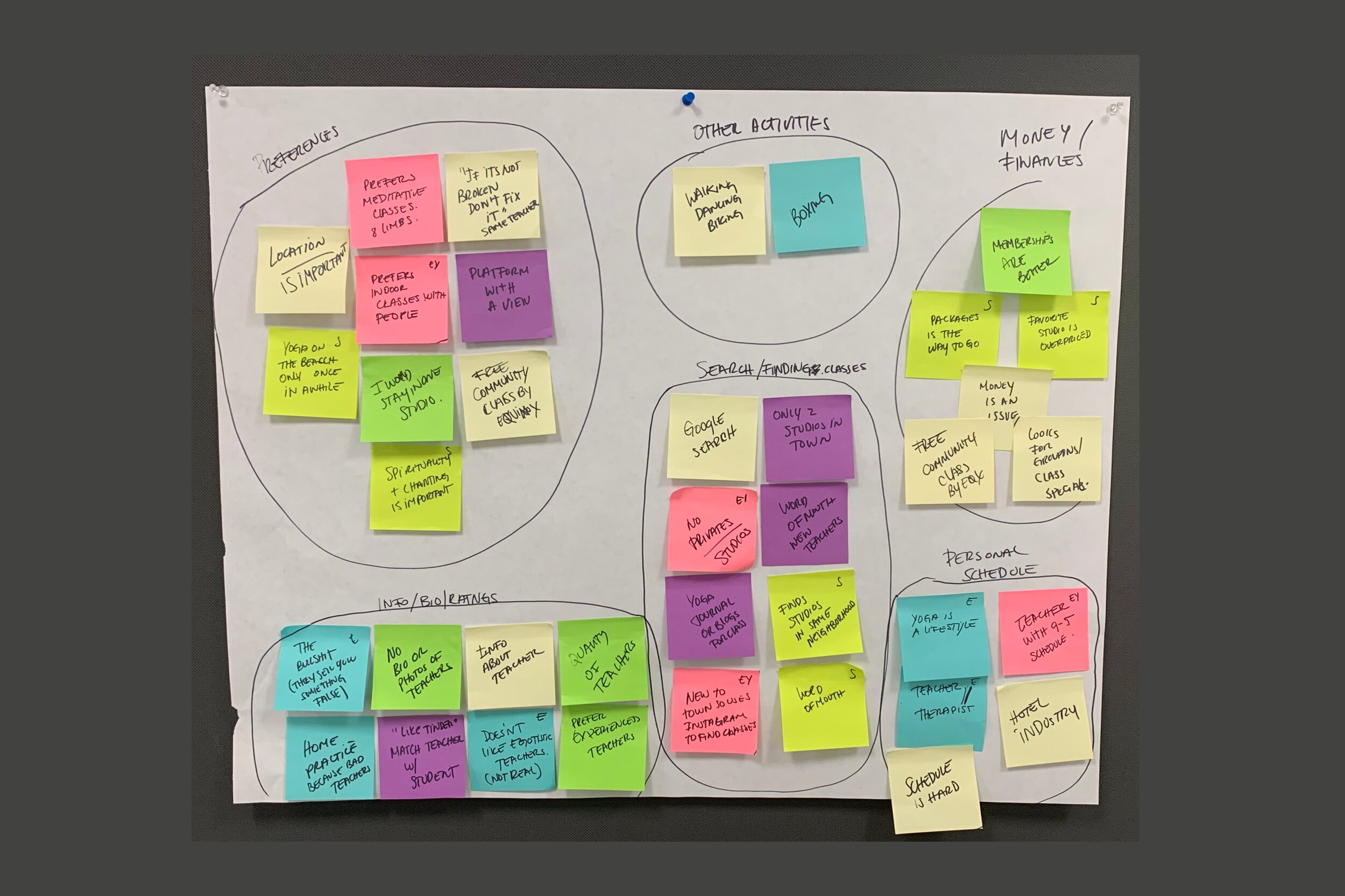
I created two personas using the interview results. I referred to them throughout the entire product development process.
Personas include the following sections: quotations, bio, demographics, scenarios, goals/needs and behaviors.




Card Sorting Learnings
Card sorting was key to my navigation and sitemap progress.
My initial site map idea got condensed from 4 main menu tabs to only 3, which made everything much simpler.
After going through them, it was very evident that explore could be combined with search.


Key Screens and Onboarding Sketches Analysis
Choosing the main key screens was a little difficult but also helped define the most important functionalities of the application, which is the process of selecting a class.
The onboarding sketch also helped me define in a few slides what the main functionalities of this app are, and I feel more confident now that it’s narrowed down.

I conducted 5 in-person, tests of my Invisionapp prototype. All users had very similar behaviours and feedback.
Common Findings
Positive
- Overall the flow was easy to navigate
- Easy navigation to get to payment
- Great simplicity
Room for Improvement
- It’s important to mention the location
- The price should be placed in the card
- Users use filters more than sorting, add it
- Add pics of the studios
- After thank you return to main page

Next Steps
- Launch this as MVP
- Add the “choosing a private class” experience
- Adding a search button
- Making the experience about how teachers find students too
- A chat for students to connect with studios/ teachers
- Explore the sharing classes with friends possibility
- Announcing events in the city related to yoga / community classes
- Rewards for booking a certain amount of classes
- Class recommendations/ matching according to personality/ lifestyle surveys


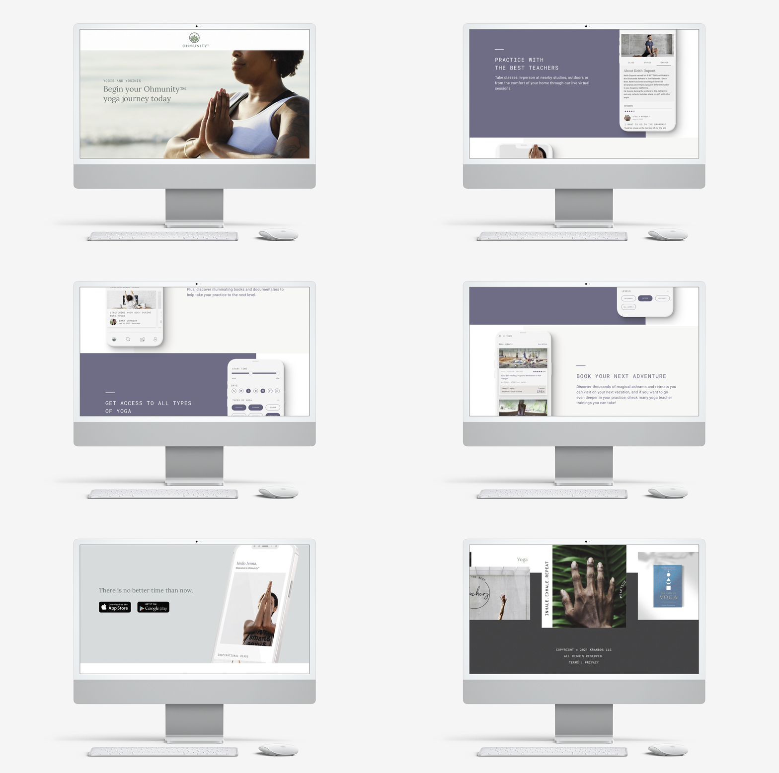
As we began to develop the app, there were some iterations in the design, mostly in fonts and colors, for a fresher, more minimalistic look and feel.
To view and/or download app go to Ohmunity.com
